Menu item highlighting improvements
The problem
In a hierarchical menu, a menu item with subitems may or may not do something when selected, and you can’t tell by looking at it.
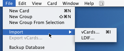
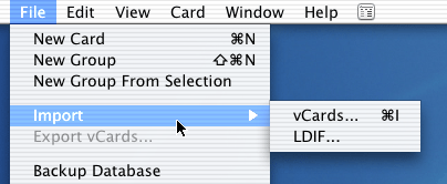
In the screen shot below, the Import menu item, like most such hierarchical menu items, doesn’t invoke any action when selected. Selecting it merely makes the menu go away.
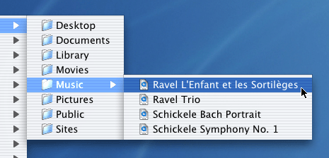
In the screen shot below, the Music menu item does something when selected: it opens the Music folder. Proficient users know this, but many novices don’t. Their mental model is that a hierarchical menu item is only useful as a stepping stone to subitems.
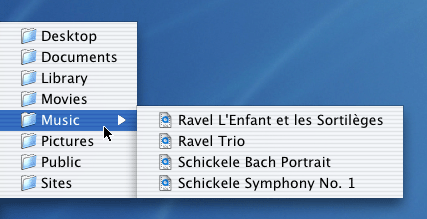
Looks the same as the first example, doesn’t it? How do we know it’s different? Proficient users get to know by context whether a hierarchical item will do something when selected, usually because they are curious and they experiment a lot, but sometimes through discovery by accident or even through reading. I know users who have used Macs for years and don’t know about this feature.
Naive users should be given a clue.
Proficient users benefit from clues, too.
The solution
I propose the following solution:
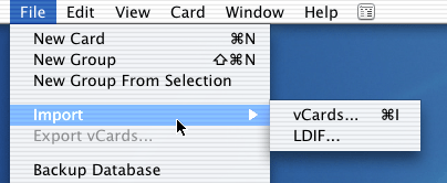
When the cursor is over a menu item that invokes an action, it is highlighted with a full-strength highlighting color. Otherwise menu item highlighting uses a dimmed highlighting color.
With this new design in place, it becomes clear from the strong highlighting color that the Music menu does something when selected:

While the Import menu item does not:
In some situations, selecting the menu item actually selects a submenu item (typically the first one):

Few programs implement this shorthand because it is very unobvious. However, using our new expressive power, we can explicitly indicate that selecting the New menu item will take an action, and we can also indicate which action that will be:

Furthermore, we are now empowered to push the envelope with safety and allow any submenu item, not just the first one, to be selected when you select New.

With this new capability a user preference could specify HTML Document as the default instead of Text Document, for example.
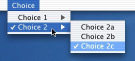
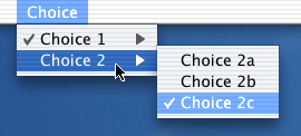
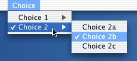
The new capability can also be useful when the top-level menu item is a choice that implies a subitem refinement of that choice. In the following example, the user can quickly go back and forth between two choices, one in the Choice 1 group, and one in the Choice 2 group. As we join the story, the user is about to choose Choice 2c again simply by selecting the Choice 2 menu item:
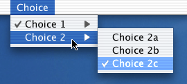
After the user has selected the Choice 2, the result is this:
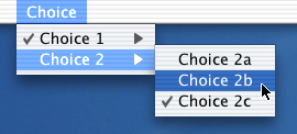
If the user instead had wanted to change to Choice 2b, they would select Choice 2b in the submenu:
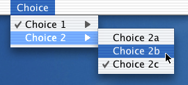
with this result:
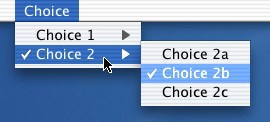
But there’s a catch here. Neither the Mac’s Cocoa UI toolkit nor the Java Swing UI toolkit allow a checkmark on a hierarchical menu item. This limitation should be removed.
(There is also another problem with checkmarked menu items on the Mac: You can’t tell if a checkmark acts like a checkbox or like a radio button. They look the same. Other GUI systems have fixed this problem.)
One last touch
In light of the above, we should rethink the highlighting of all menu items on a hierarchical path. In the example below, we see three highlighted menu items in the path:
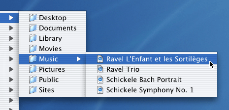
To be consistent, we should follow the simple rule that full-intensity highlighting is used only on the current menu item and only if it will cause an action when selected:
To complete the consistency of the design, even the menu bar item must use the dimmed highlighting because it never invokes an action:



http://Yost.com/information-design/menu-highlighting/ - this page
2002-11-16 Created
2002-11-17 Modified
2002-11-27 Modified cosmetically