Visualizing
lifestyle vs. lifespan
Existing visualizations
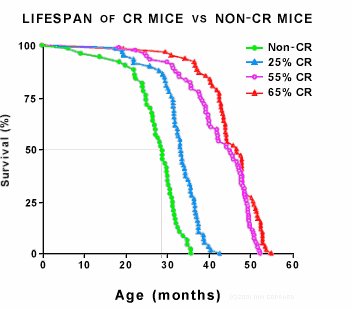
Typical visualizations of the effects of calorie restriction on maximum lifespan look like this:
 |
| Calorie Restriction Society |
 |
| Nicotinamide and PNC1 govern lifespan extension by calorie restriction in Saccharomyces cerevisiae Rozalyn M. Anderson, Kevin J. Bitterman, Jason G. Wood, Oliver Medvedik and David A. Sinclair Nature 423, 181-185(8 May 2003) |
A paper showing the correlation of body mass index (BMI) and survival has visualizations like this:
 |
| Overweight, Obesity, and Mortality in a Large Prospective Cohort of Persons 50 to 71 Years Old Kenneth F. Adams, Ph.D., Arthur Schatzkin, M.D., Tamara B. Harris, M.D., Victor Kipnis, Ph.D., Traci Mouw, M.P.H., Rachel Ballard-Barbash, M.D., Albert Hollenbeck, Ph.D., and Michael F. Leitzmann, M.D. N Engl J Med. 2006 Aug 24;355(8):763-78. Epub 2006 Aug 22. |
The Problem
The visualizations above are not effective at showing the impact on a person’s life. How am I to translate the survival rate of a population into what that means for my lifespan? What does an increase form 1% risk of death to 1.5% risk of death mean for me?
Furthermore, in the case of Calorie Restriction, a.k.a. the CRON diet (Calorie Restricted Optimal Nutrition), I have not seen a good measure of the risk involved in overdoing it, that is, eating too few calories.
Solution
The clearest way I can think of to express the impact of a lifestyle choice on someone’s life is to show how many years of their life they will forfeit as a result of a lifestyle choice.
The following graph shows maintenance calorie intake. This is a completely different situation from weight-loss calorie intake. To reduce body fat, you must (among other things) eat fewer than the optimal number of calories until you have reached your healthy weight, then you switch over to maintenance mode. Maintenance mode requires, of course, more calories than weight loss mode.
 |
| (speculative graph created by DY for this web page) |
I hasten to point out that this graph is guesswork on my part. I don’t claim that the actual numbers are accurate, but I do believe the approximate shape of the curve has to be correct.
Clearly if you stop eating altogether (A), you will die in a matter of weeks. If you eat most of what your body needs, but not enough (B), you will live a little longer, but not a whole lot longer. At the other end of the graph, clearly if you stuff yourself all day long, you will become very unhealthy and die before your time. If you eat way too much, but not an extreme amount (E), you will become somewhat less unhealthy than that, etc.
So somewhere there is a middle ground that is just right (C). It is unlikely that the curve has any odd bumps on either side of that point. The overall shape of the curve has to be steep on the left and gradual on the right, as you see above.
Point D on the graph is an interesting data point. It is comes from over 2,000 animal experiements since the 1930s, as reported in Roy Walford’s excellent book. Those experiments tell us that if an animal eats about 1.5x more calories than the optimal amount, its maximum possible lifespan is shortened by about 1.5x. Also, BTW, animals in the studies eat about 1.5x more than optimal if allowed to eat all they want. (If you put milkshakes, sodas, desserts, sugared coffee, fries, and the like into the mix, I bet that the animals would become addicted and eat a lot more, as we humans do, but I don’t know if that has been tried. Experiments tend to use relatively healthy, unrefined ‘chow’ designed for lab experiments.)
The region of the graph around the optimal calorie intake is the most interesting. Is it sharp, as I show it? It would be very interesting and useful to know the answer to that question.
This graph is estmated for a person who is 40 years old and who up until that age has eaten about 1.5x the optimal number of calories, giving him a maximum lifespan of perhaps 104 if he does everything right from now on.
A couple of things jump out at you from this graph.
- Even 500 extra calories per day can cost you 20 years of (healthy) lifespan. (We know from the extensive, 70-year record of Calorie Restriction scientific literature that optimal calorie intake doesn’t just add more years — it significantly delays or even completely avoids the so-called ‘age-onset’ diseases until well after you might have already died from those diseases on a regimen of excess calorie intake.)
- The lifespan cost of eating some number fewer than the optimal number of calories is very high compared to the lifespan cost of eating the same number more than the optimal number of calories. Clearly, if our 40-year-old eats zero calories he will die in about a month, thus forfeiting 64 years of life. Even a couple hundred calories less than required could cause him to starve to death in a short time and lose almost all of his remaining lifespan. Since no one can know what the optimal number of calories is for a given person, and since the penalty for undereating is so severe, it’s clearly wise to be careful and eat a little more than a little less.
Summary
Years of life lost should be on the Y axis of graphs dealing with lifespan issues. Measures of relative risk of death, percent survival, and percent of lifespan are not effective for communicating impact on a person’s life.
http://Yost.com/health/lifespan/index.html - this page
2008-10-05 Created
2019-02-09 Fixed broken calorierestriction.org link